CloudPulse — Next.js SaaS Dashboard Template
Next.js 15 cloud deployment dashboard template. Railway/Vercel-style UI with deployments, monitoring, logs, env vars & dark mode. Ship faster.
Secure checkout via Gumroad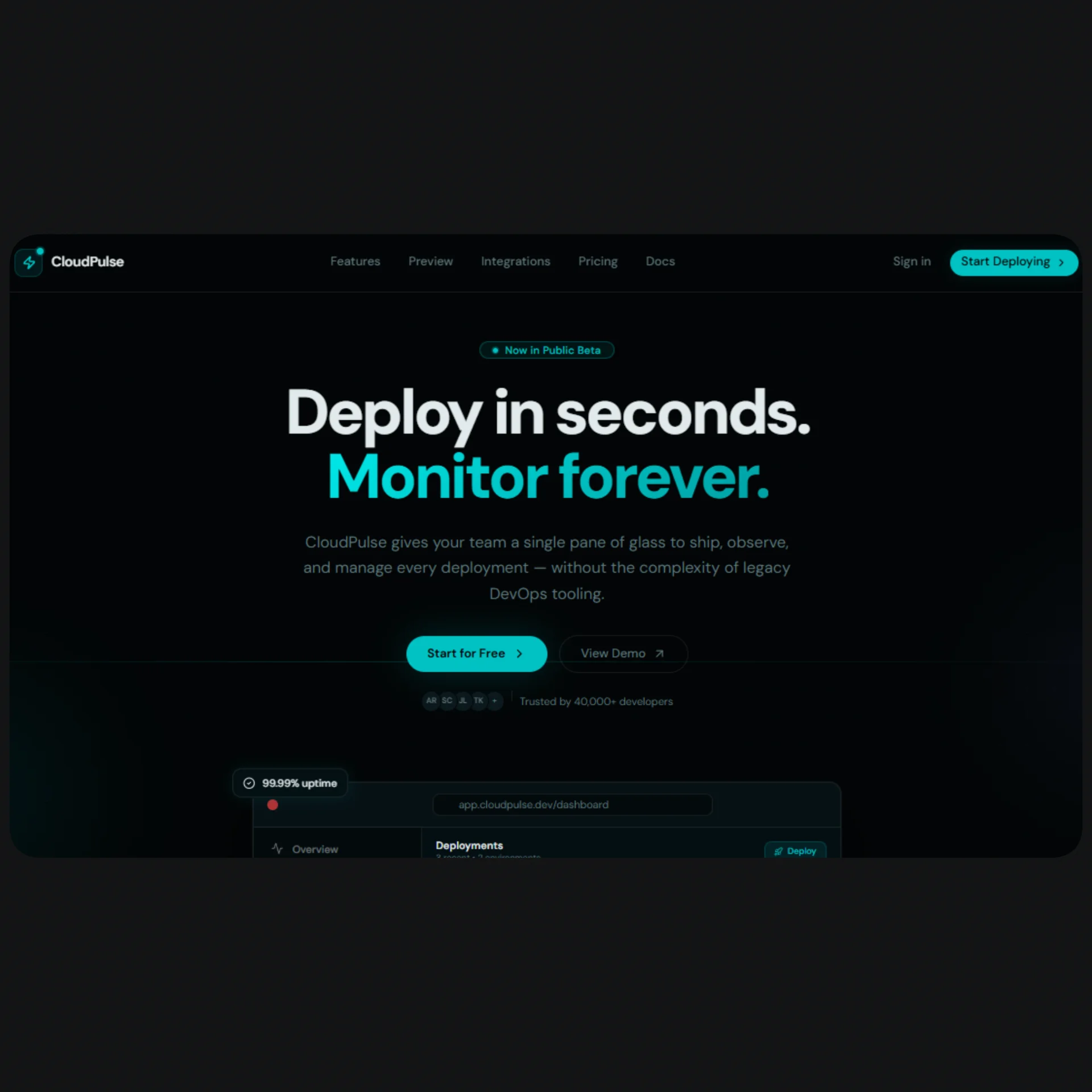
Overview
CloudPulse is a premium Next.js 15 SaaS dashboard template built for developers who want a production-ready cloud deployment UI out of the box. Inspired by Railway and Vercel, it ships with a fully-designed dark mode interface powered by Tailwind CSS v4, shadcn/ui, and a custom oklch color system centered on electric cyan. Whether you're building a cloud platform, a developer tools product, or an internal infrastructure dashboard, CloudPulse gives you a pixel-perfect starting point with zero wasted setup time. Every page, component, and section is carefully crafted with responsive layouts, accessible markup, and a design language that feels modern and premium.
The template includes a complete public landing page with Hero, Features (9 cards), interactive Dashboard Preview, Metrics counters, Integrations hub, Pricing (3 plans + comparison table), CTA, and Footer — all driven from a single config file. The internal app ships six fully-built pages: an Overview dashboard with activity charts and stat cards; a Deployments list with status filters, search, and environment tabs; a Monitoring page with Recharts area and bar charts plus a 90-day uptime strip; a Logs terminal with live streaming simulation, level filters, and search highlighting; an Environment Variables manager with per-environment tabs, masked values, and add/delete dialogs; and a Project Settings page with five tabbed sections (General, Domains, Build, Team, Danger Zone). All pages are wired to a central config file at @/lib/config — swap the mock data for real API calls and you ship.
CloudPulse is built on the latest Next.js 15 App Router with TypeScript throughout, Tailwind CSS v4 with a fully custom theme defined in globals.css using oklch color space, and Motion (motion/react) for all animations. The template ships with a complete SEO setup: global metadata in app/layout.tsx, per-page static metadata, and generateMetadata helpers for dynamic routes (/deployments/[id], /projects/[id]/settings, /projects/[id]/env). All components use shadcn/ui primitives — no custom re-implementations of things like Sidebar, Table, Dialog, Select, or Switch. Icons come from lucide-react, charts from Recharts. This is a production-grade Next.js SaaS template for cloud deployment dashboards, developer tools platforms, and infrastructure monitoring products.
Stack
| Layer | Technology |
|---|---|
| Framework | Next.js 15 (App Router) |
| Language | TypeScript |
| Styling | Tailwind CSS v4 |
| Components | shadcn/ui |
| Animations | Motion (motion/react) |
| Icons | lucide-react |
| Charts | Recharts |
| Fonts | Geist Sans + Geist Mono |
| Color System | oklch — dark mode only |
Project Structure
cloudpulse/
├── app/
│   ├── layout.tsx                  # Root layout + global metadata
│   ├── page.tsx                    # Landing page
│   ├── dashboard/
│   │   ├── layout.tsx              # App sidebar layout (SidebarProvider)
│   │   └── page.tsx                # Dashboard overview
│   ├── deployments/
│   │   └── page.tsx                # Deployments list + filters
│   ├── monitoring/
│   │   └── page.tsx                # Monitoring charts + uptime
│   ├── logs/
│   │   └── page.tsx                # Terminal log viewer
│   └── projects/[id]/
│       ├── env/
│       │   └── page.tsx            # Environment variables manager
│       └── settings/
│           └── page.tsx            # Project settings (5 tabs)
├── components/
│   ├── landing/
│   │   ├── navbar.tsx
│   │   ├── hero.tsx
│   │   ├── features.tsx
│   │   ├── dashboard-preview.tsx
│   │   ├── metrics.tsx
│   │   ├── integrations.tsx
│   │   ├── pricing.tsx
│   │   ├── cta.tsx
│   │   └── footer.tsx
│   └── ui/                         # shadcn/ui components
├── lib/
│   ├── config.tsx                  # Central content + mock data config
│   └── utils.ts
├── metadata.tsx                    # Global + per-page SEO metadata
├── globals.css                     # Tailwind v4 theme + oklch palette
└── tailwind.config.ts
Quick Start
1. Clone & Install
git clone https://github.com/your-handle/cloudpulse
cd cloudpulse
pnpm install
2. Install shadcn/ui components
pnpm dlx shadcn@latest add sidebar button badge card input \
  select tabs table dialog alert-dialog switch label \
  separator dropdown-menu avatar
3. Configure fonts
Add Geist to your project:
pnpm add geist
Then wire it in app/layout.tsx:
import { GeistSans } from "geist/font/sans";
import { GeistMono } from "geist/font/mono";
4. Add globals.css
Paste the full globals.css provided in the template. It includes the complete oklch color palette, Tailwind v4 @theme inline block, and utility shadows like --shadow-glow-primary, --shadow-glow-sm, and --background-image-gradient-hero.
5. Run dev server
pnpm dev
# → http://localhost:3000
Customization
Brand & Content
All copy, navigation links, feature descriptions, pricing plans, integration names, stats, and footer columns live in a single file:
lib/config.tsx
Edit the exported config objects to match your product. No prop-drilling or scattered constants — one file controls everything. The following objects are available:
siteConfig— name, URL, OG image, keywords, locale, TwitternavConfig+sidebarConfig— landing nav + app sidebar linksheroConfig— headline, subheadline, stats, CTAsfeaturesConfig— 9 features with icons and accent colorspricingConfig— 3 plans + full comparison table rowsintegrationsConfig— integration logos and categoriesmetricsConfig— animated counter valuesctaConfig+footerConfig— CTA copy and footer columnsdeploymentsConfig,logsConfig,monitoringConfig,envConfig,projectSettingsConfig— mock data for all app pages
Colors
The color system lives in globals.css inside the :root block. All values use oklch. The primary accent is electric cyan (oklch(0.72 0.16 195)). To rebrand:
- Update
--primaryand--accentin:root - Update the matching
--shadow-glow-*variables in@theme inline - Update
--background-image-gradient-heroand--background-image-gradient-primary
Connecting Real Data
Every page uses mock data from @/lib/config. To wire in real APIs:
- Replace
deploymentsConfig.mockwith afetch()or tRPC call in/deployments/page.tsx - Replace log lines in
/logs/page.tsxwith a WebSocket or SSE stream - Replace monitoring data with your metrics API (e.g. Prometheus, Datadog, Axiom)
- Replace
envConfig.mockwith your secrets manager API (e.g. Vercel API, Infisical) - Replace
projectSettingsConfig.mockwith your project management API
Adding New Pages
The sidebar navigation is defined in the navMain and navProject arrays inside app/dashboard/layout.tsx. Add a new entry:
{
  label: "Analytics",
  href: "/analytics",
  icon: BarChart3,
}
Then create app/analytics/page.tsx with a default export and it will automatically appear in the sidebar with the correct active state.
SEO Setup
All SEO logic is centralized in metadata.tsx. Here is how to wire each piece:
Global metadata — app/layout.tsx
import { globalMetadata } from "@/metadata";

export const metadata = globalMetadata;
Per-page static metadata
// app/dashboard/page.tsx
import { dashboardMetadata } from "@/metadata";

export const metadata = dashboardMetadata;
Available exports: dashboardMetadata, deploymentsMetadata, monitoringMetadata, logsMetadata, envMetadata, settingsMetadata.
Dynamic route metadata
// app/deployments/[id]/page.tsx
import { generateDeploymentMetadata } from "@/metadata";

export { generateDeploymentMetadata as generateMetadata };
Available generators: generateDeploymentMetadata, generateProjectSettingsMetadata, generateProjectEnvMetadata.
Updating site info
All values (site name, URL, OG image, keywords, Twitter handle) live in the siteConfig object at the top of lib/config.tsx. Update once — metadata.tsx reads from it automatically.
export const siteConfig = {
  name: "YourProduct",
  url: "https://yourproduct.com",
  ogImage: "https://yourproduct.com/og.png",
  twitter: "@yourhandle",
  // ...
};
Final Notes
💡 No hardcoded styles
Every color, shadow, and gradient references a CSS variable fromglobals.css. Never usestyle={{}}inline overrides — use Tailwind utility classes that map to your theme tokens.
📱 Fully responsive
Every section and page is built mobile-first. The sidebar collapses to icon mode viaSidebarRail. All tables degrade gracefully on small screens with hidden columns viahidden md:block. Landing sections reflow from 1 col → 2 col → 3+ col.
♿ Accessible
All interactive elements havearia-label, decorative icons usearia-hidden="true", the terminal usesrole="log"witharia-live="polite", feature lists userole="list", and heading hierarchy (h1 → h2 → h3) is consistent throughout.
🧹 shadcn/ui only — no custom re-inventions
The template uses shadcn/uiSidebar,Table,Dialog,AlertDialog,Select,Switch,Tabs,Badge,Button,Avatar,DropdownMenu,Separator, and more. Never duplicate components that shadcn already provides.
🌙 Dark mode only
The template ships dark-mode-only. The oklch palette is defined in:root(not.dark). If you need light mode support, duplicate the:rootblock into a.lightclass and wire it vianext-themes.
📁 One config to rule them all
lib/config.tsxis the single source of truth for all content, copy, mock data, and navigation. You never need to hunt through component files to change a headline or a pricing plan.