DevPulse — Next.js Developer Analytics Suite Template
Next.js 15 analytics dashboard template with event tracking, funnels, session replay & real-time feed. Dark mode, Tailwind v4, shadcn/ui, TypeScript.
Secure checkout via Gumroad
Overview
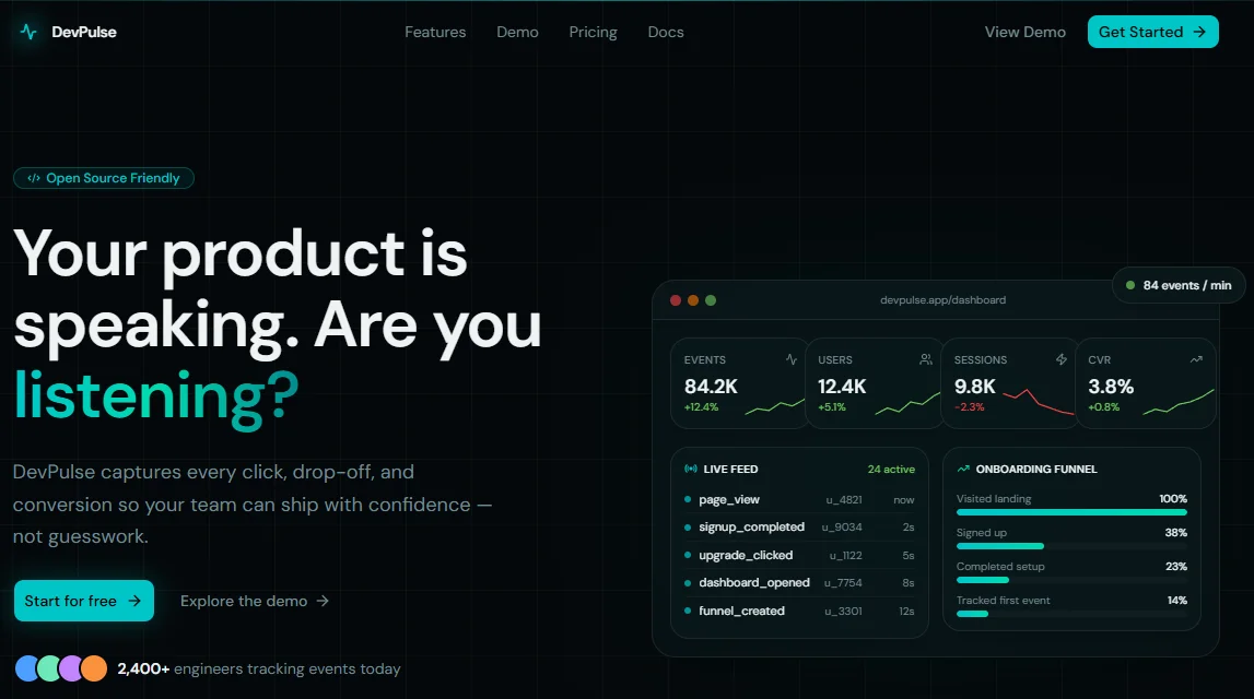
DevPulse is a premium Next.js analytics dashboard template built for developers and indie hackers who want a production-ready alternative to tools like Mixpanel or PostHog. It ships with a fully designed marketing landing page and a complete internal dashboard — event tracking, funnel analysis, session replay, and a real-time activity feed — all wired up to a clean, dark-mode-only design system built on Tailwind CSS v4 and shadcn/ui. Whether you're building a SaaS analytics product, an internal metrics tool, or a client-facing data platform, DevPulse gives you the UI foundation to move fast without starting from scratch.
Every section of this Next.js SaaS template has been crafted with conversion and visual impact in mind. The marketing landing page includes an animated dashboard mockup in the hero, a features grid, a step-by-step how-it-works section, social proof testimonials, a full pricing table with a collapsible comparison matrix, and a high-converting final CTA — all powered by Framer Motion scroll animations and a consistent cyan-on-dark design language. The dashboard itself covers six internal pages: Overview with recharts area and bar charts, Events with a sortable filterable table, Funnels with animated step bars and drop-off indicators, Sessions with an expandable row detail view, Realtime with a live-simulated event feed, and Settings with six tabbed sections covering API keys, team management, billing, notifications, and security.
Built entirely with TypeScript, the template enforces strict type safety across all components, config files, and metadata helpers. All site content lives in a single lib/config.tsx file — headlines, nav links, pricing plans, feature lists, dashboard copy — making it trivial to white-label or adapt to any niche. SEO is handled through a layered lib/metadata.ts with global metadata, per-page static exports, and dynamic generateMetadata helpers for project, funnel, and session detail pages. No hardcoded styles, no inline style={}, no arbitrary values — every color, gradient, glow, and radius references a CSS custom property defined in globals.css.
Stack
| Layer | Technology | |---|---| | Framework | Next.js 15 (App Router) | | Language | TypeScript | | Styling | Tailwind CSS v4 | | Components | shadcn/ui | | Animation | Motion (Framer Motion v11) | | Charts | Recharts | | Icons | Lucide React | | Font | DM Sans (Google Fonts) | | CSS tokens | oklch color space, dark mode only |
Project Structure
devpulse/
├── app/
│ ├── globals.css # Design tokens, color palette, gradients
│ ├── layout.tsx # Root layout (font, metadata, body)
│ ├── page.tsx # Landing page (assemble sections here)
│ └── dashboard/
│ ├── layout.tsx # Dashboard shell (sidebar + header)
│ ├── page.tsx # Overview page
│ ├── events/
│ │ └── page.tsx # Events table + frequency chart
│ ├── funnels/
│ │ └── page.tsx # Funnel visualizer + breakdown table
│ ├── sessions/
│ │ └── page.tsx # Sessions list with expandable rows
│ ├── realtime/
│ │ └── page.tsx # Live event feed + active counter
│ └── settings/
│ └── page.tsx # Settings (6 tabs)
├── components/
│ ├── landing/
│ │ ├── Navbar.tsx # Sticky navbar with mobile drawer
│ │ ├── Hero.tsx # Hero with animated dashboard mockup
│ │ ├── Features.tsx # Asymmetric features grid
│ │ ├── HowItWorks.tsx # 3-step section with code snippets
│ │ ├── Testimonials.tsx # 3-card testimonial section
│ │ ├── Pricing.tsx # Plan cards + collapsible comparison table
│ │ ├── FinalCTA.tsx # Closing CTA banner
│ │ └── Footer.tsx # Footer with columns + legal links
│ └── dashboard/
│ ├── DashboardSidebar.tsx # Collapsible sidebar with active indicator
│ └── DashboardHeader.tsx # Sticky header with breadcrumb + mobile nav
├── lib/
│ ├── config.tsx # All site content (landing + dashboard)
│ ├── metadata.ts # Global, per-page, and dynamic metadata
│ └── utils.ts # cn() utility (shadcn default)
├── public/ # Static assets (favicon, og image, etc.)
└── package.json
Quick Start
The template is distributed as a ZIP file. Download and unzip it — everything is already included.
1. Unzip and enter the directory
unzip devpulse.zip
cd devpulse
2. Install dependencies
npm install
3. Run the development server
npm run dev
Open http://localhost:3000 to see the landing page and http://localhost:3000/dashboard for the dashboard.
4. Assemble the landing page
The landing app/page.tsx and root app/layout.tsx are left intentionally minimal so you can import sections in the order you want. A typical setup:
// app/page.tsx
import { Navbar } from "@/components/landing/Navbar";
import { Hero } from "@/components/landing/Hero";
import { Features } from "@/components/landing/Features";
import { HowItWorks } from "@/components/landing/HowItWorks";
import { Testimonials } from "@/components/landing/Testimonials";
import { Pricing } from "@/components/landing/Pricing";
import { FinalCTA } from "@/components/landing/FinalCTA";
import { Footer } from "@/components/landing/Footer";
export default function LandingPage() {
return (
<>
<Navbar />
<main>
<Hero />
<Features />
<HowItWorks />
<Testimonials />
<Pricing />
<FinalCTA />
</main>
<Footer />
</>
);
}
Customization
Brand & Content
All copy, navigation links, pricing plans, feature items, testimonials, and dashboard labels live in one place:
lib/config.tsx
Open it and edit the exported objects at the top of each section. The file is organized by page/section with clear comments — SITE, HERO, FEATURES, PRICING, DASHBOARD, etc. Every component reads from config, so changing a value there propagates everywhere automatically.
Colors
The full color palette is defined in app/globals.css inside :root. All values use the oklch color space for perceptual uniformity. To change the primary color (currently cyan oklch(0.72 0.18 195)), update:
:root {
--primary: oklch(0.72 0.18 195); /* ← change hue (195 = cyan) */
--accent: oklch(0.78 0.18 175); /* ← complementary accent */
--ring: oklch(0.72 0.18 195); /* ← match primary */
}
The @theme inline block at the top of globals.css also defines reusable gradient and glow variables used across all sections:
--background-image-gradient-hero: /* radial hero glow */
--background-image-gradient-card: /* card fill gradient */
--background-image-glow-primary: /* large section glow */
--background-image-glow-accent: /* small card glow */
--background-image-grid: /* dot/grid texture */
Update these to match your new primary color if you change the palette.
Typography
The template uses DM Sans loaded via next/font/google. To swap fonts, open app/layout.tsx:
import { Inter } from "next/font/google"; // ← swap here
const inter = Inter({ subsets: ["latin"], variable: "--font-sans" });
Any Google Font works as a drop-in replacement. The --font-sans variable is referenced throughout globals.css and Tailwind config.
Mock Data
Dashboard pages use local mock data defined at the top of each page file. Replace these arrays with real API calls, SWR hooks, or server actions as needed. The component structure is data-agnostic — shapes are consistent with TypeScript interfaces so swapping the source is straightforward.
SEO Setup
All metadata is managed in lib/metadata.ts. It exports:
Global metadata (for app/layout.tsx):
import { globalMetadata } from "@/lib/metadata";
export const metadata = globalMetadata;
Per-page static metadata (for each page.tsx):
import { eventsMetadata } from "@/lib/metadata";
export const metadata = eventsMetadata;
Dynamic metadata (for pages with params):
import { generateProjectMetadata } from "@/lib/metadata";
export async function generateMetadata({ params }) {
return generateProjectMetadata(params.projectName);
}
Available static exports: landingMetadata, dashboardMetadata, eventsMetadata, funnelsMetadata, sessionsMetadata, realtimeMetadata, settingsMetadata.
Available dynamic helpers: generateProjectMetadata(name), generateFunnelMetadata(name), generateSessionMetadata(id).
OG Image
Replace public/og.png with a 1200×630 PNG. The URL is set in lib/config.tsx under siteConfig.ogImage. Both OpenGraph and Twitter Card metadata reference this value automatically.
Sitemap & Robots
Add app/sitemap.ts and app/robots.ts to your project as Next.js 15 supports these natively:
// app/sitemap.ts
import { siteConfig } from "@/lib/config";
export default function sitemap() {
return [
{ url: siteConfig.url, lastModified: new Date() },
{ url: `${siteConfig.url}/docs`, lastModified: new Date() },
];
}
// app/robots.ts
export default function robots() {
return {
rules: { userAgent: "*", allow: "/", disallow: "/dashboard/" },
};
}
Final Notes
-
Dark mode only. The template is intentionally single-mode. Removing the dark constraint and adding a light palette is possible by duplicating
:rootvariables into a.lightclass and toggling withnext-themes. -
shadcn/ui components. The template uses
Badge,Button,Input,Select,Tabs,Table,Switch,Label,Separator,Collapsible,DropdownMenu, andTooltip. If you haven't added them yet, install via the shadcn CLI:npx shadcn@latest add [component]. -
Motion. All animations use
motion/react(Framer Motion v11 package name). Entrance animations are driven byuseInView— they fire once per mount, respecting reduced-motion preferences by default through the browser. -
Recharts. Chart colors reference raw
oklch()strings defined inglobals.css. If you change the palette, update the correspondingstrokeandfillvalues in the chart components inside each dashboard page. -
No authentication. The template ships without auth. For a production app, drop in NextAuth.js or Clerk — the dashboard layout is already structured to wrap a session provider.
-
No database. All data is mocked locally. Connect your data layer (Supabase, PlanetScale, Drizzle, Prisma) by replacing the mock arrays in each dashboard page with real queries or API calls.
-
Responsive. Every page and component is fully responsive. Breakpoints follow Tailwind defaults:
sm(640px),md(768px),lg(1024px). The sidebar hides on mobile and is replaced by a slide-in drawer.