All templates
SaaS

FinanceOS — Next.js Personal Finance SaaS Template

Premium Next.js 15 personal finance dashboard template. Budget tracker, expense analytics, subscription manager & savings goals. Tailwind v4 + shadcn/ui.
Secure checkout via Gumroad
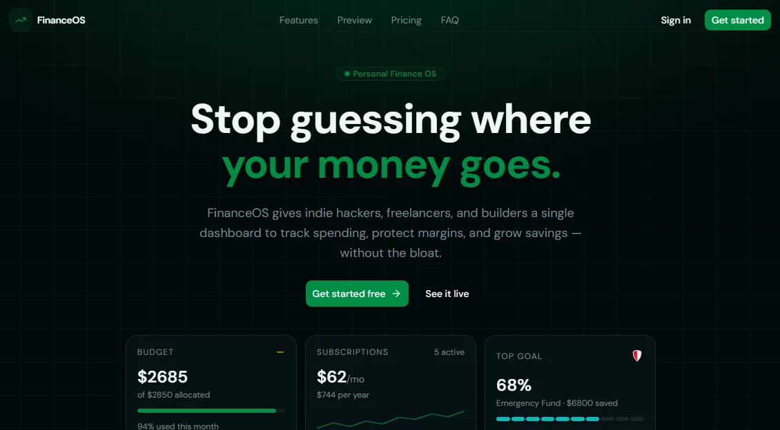
FinanceOS — Next.js Personal Finance SaaS Template preview

Overview

FinanceOS is a production-ready personal finance dashboard template built with Next.js 15 App Router, Tailwind CSS v4, shadcn/ui, TypeScript, and Framer Motion. It ships with a fully designed marketing landing page and five complete internal dashboard modules — budget management, expense analytics, subscription tracking, savings goals, and transaction history — all wired to a central config.tsx so you can white-label and deploy it as your own SaaS product in hours, not weeks. Every page is dark-mode only, fully responsive, and built to a premium standard that stands out in any marketplace or portfolio.

Whether you're an indie hacker looking to launch a personal finance SaaS, a developer building a client-facing money management tool, or a freelancer who needs a polished financial dashboard for internal use, FinanceOS gives you the complete foundation. The landing page includes a hero with live financial metric cards, a bento-grid features section, an interactive pricing toggle with monthly and yearly billing, a masonry testimonials layout, a shadcn Accordion FAQ, and a CTA section — all content-driven from a single config file with full TypeScript types. The dashboard uses the shadcn Sidebar with icon-collapse support, sticky header with notifications, and per-page metadata via a reusable generateMetadata helper.

Every component follows strict production standards: no hardcoded styles, no style={} props, all colors via oklch CSS variables, "use client" scoped only to interactive components, and recharts for all data visualizations. The included demo data makes the template immediately presentable for client demos or marketplace screenshots. The config-driven architecture means changing the product name, palette, pricing, or copy requires editing exactly one file — making FinanceOS one of the most maintainable Next.js SaaS templates available today.


Stack

| Layer | Technology | |---|---| | Framework | Next.js 15 (App Router) | | Language | TypeScript | | Styling | Tailwind CSS v4 with @theme inline | | Components | shadcn/ui | | Animations | Framer Motion (motion/react) | | Charts | Recharts | | Icons | Lucide React | | Color system | oklch dark mode only | | Font | Geist (Sans + Mono) |


Project Structure

financeos/
├── app/
│   ├── layout.tsx               # Root layout — import globalMetadata here
│   ├── page.tsx                 # Landing page — assemble sections here
│   ├── dashboard/
│   │   └── page.tsx             # → dashboard-page.tsx
│   ├── budget/
│   │   └── page.tsx             # → budget-page.tsx
│   ├── expenses/
│   │   └── page.tsx             # → expenses-page.tsx
│   ├── subscriptions/
│   │   └── page.tsx             # → subscriptions-page.tsx
│   ├── savings/
│   │   └── page.tsx             # → savings-page.tsx
│   ├── transactions/
│   │   └── page.tsx             # → transactions-page.tsx
│   └── settings/
│       └── page.tsx             # → settings-page.tsx
│
├── components/
│   ├── landing/
│   │   ├── navbar.tsx
│   │   ├── hero.tsx
│   │   ├── features.tsx
│   │   ├── pricing.tsx
│   │   ├── testimonials.tsx
│   │   ├── faq.tsx
│   │   ├── cta-final.tsx
│   │   └── footer.tsx
│   ├── dashboard/
│   │   └── dashboard-layout.tsx
│   └── ui/                      # shadcn/ui components (auto-generated)
│
├── config.tsx                   # ← All content, types & demo data
├── metadata.tsx                 # Global metadata + generateMetadata helper
│
├── public/
│   ├── favicon.ico
│   ├── favicon-16x16.png
│   ├── favicon-32x32.png
│   ├── apple-touch-icon.png
│   └── site.webmanifest
│
├── styles/
│   └── globals.css              # Tailwind v4 theme + oklch palette + gradients
│
├── next.config.ts
├── tsconfig.json
├── components.json              # shadcn/ui config
└── package.json

Quick Start

The template is distributed as a ZIP file. Extract it, then follow these steps.

1. Extract and open

unzip financeos.zip
cd financeos

2. Install dependencies

npm install

All dependencies are already declared in package.json. No additional installs needed.

3. Start the dev server

npm run dev

Open http://localhost:3000 — the landing page loads immediately with demo content.

4. Build for production

npm run build
npm start

Customization

All content, copy, metadata, and demo data lives in a single file: config.tsx.

Brand & SEO

// config.tsx
export const siteConfig = {
  name: "FinanceOS",           // ← Your product name
  tagline: "Your money. Finally under control.",
  description: "...",          // ← Meta description (used in OG + Twitter cards)
  url: "https://financeos.app",
  ogImage: "https://financeos.app/og.png",
};

Landing content

export const hero = { ... };          // Headline, subheadline, CTAs, stats
export const features: Feature[] = [ ... ];  // 9 feature cards
export const pricingPlans: PricingPlan[] = [ ... ];  // 3 plans
export const testimonials: Testimonial[] = [ ... ];  // 6 quotes
export const faqItems: FaqItem[] = [ ... ];          // 6 Q&A pairs
export const ctaFinal = { ... };
export const footer = { ... };

Dashboard navigation

export const dashboardNav: DashboardNavItem[] = [
  { label: "Overview", href: "/dashboard", icon: LayoutDashboard },
  // Add, remove, or reorder items here
];

Demo data

Replace the demo arrays with your real data source or API calls:

export const demoBudgetCategories: BudgetCategory[] = [ ... ];
export const demoSavingsGoals: SavingsGoal[] = [ ... ];
export const demoSubscriptions: Subscription[] = [ ... ];
export const demoTransactions: Transaction[] = [ ... ];

Colors (oklch palette)

The full color system lives in styles/globals.css under :root. The primary color is emerald green (oklch(0.55 0.18 158)), accent is cold cyan (oklch(0.72 0.14 192)). To change the palette, update only these two values and all components adapt automatically:

:root {
  --primary: oklch(0.55 0.18 158);  /* ← Main brand color */
  --accent:  oklch(0.72 0.14 192);  /* ← Accent / highlight color */
}

Reusable gradients and glows are defined as CSS custom properties in @theme inline and referenced throughout components via Tailwind utilities — no inline styles needed.


SEO Setup

Global metadata

In your root app/layout.tsx, import and export globalMetadata:

// app/layout.tsx
import { globalMetadata } from "@/metadata";
export const metadata = globalMetadata;

This sets the default title template, OG image, Twitter card, robots, icons, and canonical URL for the entire app.

Per-page metadata

Each dashboard page exports its own metadata using the generateMetadata helper:

// app/budget/page.tsx
import { pageMetadata } from "@/metadata";
export const metadata = pageMetadata.budget;

Or with custom overrides:

import { generateMetadata } from "@/metadata";
export const metadata = generateMetadata("budget", {
  description: "Your custom description for this page.",
});

OG image

Replace /public/og.png with a 1200×630px image of your dashboard. Tools like OG Image Playground or Figma work well for this.

Sitemap (optional)

Add app/sitemap.ts to auto-generate a sitemap:

import type { MetadataRoute } from "next";
import { siteConfig } from "@/config";

export default function sitemap(): MetadataRoute.Sitemap {
  return [
    { url: siteConfig.url, lastModified: new Date() },
    { url: `${siteConfig.url}/dashboard`, lastModified: new Date() },
    { url: `${siteConfig.url}/pricing`,   lastModified: new Date() },
  ];
}

Final Notes

  • Dark mode only. The template is designed exclusively for dark mode using an oklch-based color system. Light mode is intentionally not included to maintain visual consistency and premium feel.

  • No bank connections. The template is UI-only — it contains no financial API integrations. All data is local state derived from config.tsx. Connecting to a real data source (Plaid, Supabase, etc.) is left to the developer.

  • shadcn/ui components. The template uses shadcn/ui primitives throughout. If you need to add more components, run npx shadcn@latest add [component] from the project root. The components.json file is already configured.

  • Recharts. All charts (area, bar, donut) use Recharts with custom tooltips and oklch color values. Chart colors reference the CSS variables from config.tsx (--chart-1 through --chart-5) for full palette consistency.

  • Framer Motion. Animations are scoped to the landing page only (motion/react). Dashboard components use Tailwind transitions for better runtime performance.

  • TypeScript strict mode. All types are defined and exported from config.tsx. No any types are used in component props.

  • Responsive. Every page is fully responsive from 320px to 1920px. The dashboard sidebar collapses to icon-only mode on smaller screens via the shadcn Sidebar collapsible="icon" prop.

  • "use client" usage. Server components are used wherever possible. "use client" is only added to components that use React state, effects, or browser APIs — keeping the bundle lean.


Built with Next.js 15, Tailwind CSS v4, shadcn/ui, TypeScript, Framer Motion, and Recharts. Distributed as a ready-to-run ZIP — extract, install, and ship.

Tech stack

NextJsTailwindCSSShadcnMotionRecharts

Tags

nextjstailwindsaaspersonalfinancemanagementtemplatemoneydashboardanalytics

Highlights

Full Next.js 15 source codeAll sections as isolated componentsglobals.css design systemconfig.tsx for easy content editingSEO: metadata, Open Graph, JSON-LDSitemap & robots.txtLifetime updates via GumroadMIT license
$49USD
Secure checkout via Gumroad
Get template