Nexus — Next.js SaaS API Management Template
Next.js 15 + Tailwind v4 SaaS template for API management platforms. Dashboard, API keys, analytics, billing & team settings. Dark mode. Production-ready.
Secure checkout via Gumroad
Overview
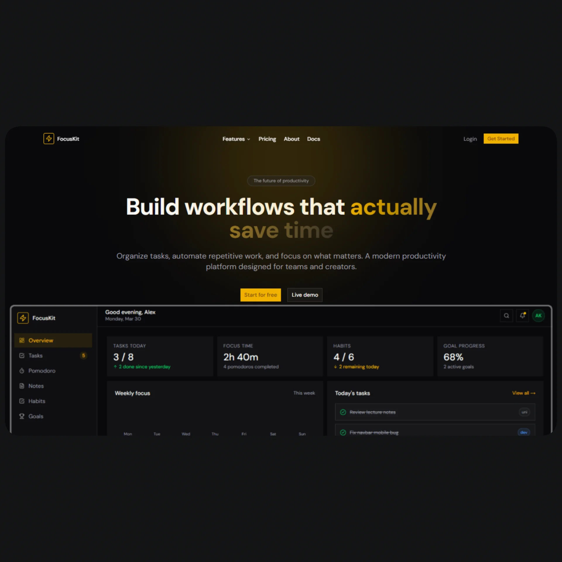
Nexus is a premium Next.js 15 SaaS template purpose-built for API management platforms, developer tools, and infrastructure products. Designed with the same visual language as Stripe, Resend, and PostHog, it gives you a production-ready starting point that looks like months of design work from day one. The full-featured landing page includes a Hero with a live code snippet, Features grid, Pricing with monthly/annual toggle, Testimonials, Stats, How It Works, and a converting CTA section — all built with Tailwind CSS v4, shadcn/ui components, and Motion animations. Every section is dark-mode only, responsive across all breakpoints, and driven by a single config.tsx file that centralizes all content and SEO metadata.
The internal dashboard covers every screen a real SaaS product needs: an Overview page with a Recharts area chart, stat cards, and a live request table; an API Keys manager with create, reveal, copy, rotate, revoke, and delete flows plus a "show-once" modal pattern; a Request Logs page with multi-filter search, semantic status coloring, and a detail Sheet with pretty-printed JSON bodies; a Usage Analytics page with period-switcher tabs driving three chart types (Area, Bar, Line) and breakdown tables; a Billing page with quota progress bar, payment method card, billing address, and invoice history with download actions; and a Settings page with five tabs covering Organization, Team invite/role management, Security (2FA, active sessions, webhook secret), Notifications per-channel toggles, and a Danger Zone with typed confirmation for destructive actions.
Every component follows strict engineering standards: no hardcoded styles, all colors and effects sourced from CSS variables defined in globals.css using oklch color space, no style={} attributes, full accessibility with aria-* labels, semantic HTML (figure, blockquote, table, nav), and keyboard navigation throughout. The template ships with a complete SEO setup via Next.js 15 generateMetadata, per-page canonical URLs, Open Graph and Twitter card metadata, and a robots config that correctly noindexes all authenticated dashboard routes. TypeScript strict mode, shadcn/ui primitives for every interactive element, and Lucide React for all icons round out a codebase that's ready to extend into a real product.
Stack
| Layer | Technology | |---|---| | Framework | Next.js 15 (App Router) | | Styling | Tailwind CSS v4 | | Components | shadcn/ui | | Language | TypeScript (strict) | | Animations | Motion (motion/react) | | Charts | Recharts | | Icons | Lucide React | | Color Space | oklch (dark mode only) |
Project Structure
nexus/
├── app/
│   ├── layout.tsx                 ← Root layout (yours to build)
│   ├── page.tsx                   ← Landing page assembly (yours to build)
│   ├── globals.css                ← oklch palette, variables, gradients, glows
│   └── dashboard/
│       ├── layout.tsx              ← dashboard-layout.tsx
│       ├── page.tsx                ← dashboard-overview.tsx
│       ├── keys/
│       │   └── page.tsx            ← dashboard-keys.tsx
│       ├── logs/
│       │   └── page.tsx            ← dashboard-logs.tsx
│       ├── usage/
│       │   └── page.tsx            ← dashboard-usage.tsx
│       ├── billing/
│       │   └── page.tsx            ← dashboard-billing.tsx
│       └── settings/
│           └── page.tsx            ← dashboard-settings.tsx
│
├── components/
│   ├── landing/
│   │   ├── navbar.tsx
│   │   ├── hero.tsx
│   │   ├── features.tsx
│   │   ├── pricing.tsx
│   │   ├── stats-howitworks.tsx
│   │   ├── testimonials.tsx
│   │   └── cta-footer.tsx
│   └── ui/                         ← shadcn/ui components (add via CLI)
│
├── config.tsx                      ← All site content
├── metadata.tsx                    ← Global + per-page metadata
└── lib/
    └── utils.ts                    ← cn() helper
Quick Start
1. Clone and install dependencies
git clone https://github.com/tu-usuario/nexus-template.git
cd nexus-template
npm install
2. Add required shadcn/ui components
npx shadcn@latest init
npx shadcn@latest add button badge input label separator switch textarea
npx shadcn@latest add card dialog dropdown-menu select sheet
npx shadcn@latest add avatar alert progress tabs tooltip scroll-area
3. Install additional dependencies
npm install motion recharts lucide-react
4. Run in development mode
npm run dev
**5. Assemble app/layout.tsx**
import type { Metadata } from "next";
import { GeistSans } from "geist/font/sans";
import { GeistMono } from "geist/font/mono";
import { globalMetadata } from "@/metadata";
import "./globals.css";

export const metadata: Metadata = globalMetadata;

export default function RootLayout({ children }: { children: React.ReactNode }) {
  return (
    <html lang="en" className="dark">
      <body className={`${GeistSans.variable} ${GeistMono.variable} antialiased`}>
        {children}
      </body>
    </html>
  );
}
**6. Assemble app/page.tsx**
import { homeMetadata } from "@/metadata";
import { Navbar }       from "@/components/landing/navbar";
import { Hero }         from "@/components/landing/hero";
import { Features }     from "@/components/landing/features";
import { Stats, HowItWorks } from "@/components/landing/stats-howitworks";
import { Pricing }      from "@/components/landing/pricing";
import { Testimonials } from "@/components/landing/testimonials";
import { CTAFinal, Footer } from "@/components/landing/cta-footer";

export const metadata = homeMetadata;

export default function HomePage() {
  return (
    <>
      <Navbar />
      <main>
        <Hero />
        <Features />
        <HowItWorks />
        <Stats />
        <Pricing />
        <Testimonials />
        <CTAFinal />
      </main>
      <Footer />
    </>
  );
}
Customization
Change name, texts, and content
All content is centralized in config.tsx. There is no need to touch any component to change texts, links, features, pricing, testimonials, or navigation.
// config.tsx
export const siteConfig = {
  name: "Your Product",          // ← Change the name
  title: "Your Product — ...",
  description: "...",
  url: "https://yourdomain.com", // ← Your domain
  // ...
};

export const pricingConfig = {
  plans: [
    {
      name: "Free",
      monthlyPrice: 0,          // ← Adjust prices
      // ...
    },
  ],
};
Change the color palette
All colors are defined in globals.css as oklch variables. Just modify :root:
:root {
  --primary: oklch(0.72 0.19 52);   /* ← Primary color (amber) */
  --accent:  oklch(0.78 0.16 68);   /* ← Accent color          */
  --background: oklch(0.13 0.01 60);/* ← Dark background       */
}
To change the overall vibe, modify the hue (third value):
52→ Amber/Orange (default)276→ Purple/Indigo (Stripe-like)160→ Green/Emerald (Resend-like)210→ Blue (linear-like)
Gradients and glows (--gradient-hero, --glow-primary, etc.) use var(--primary) and var(--accent) automatically — no need to change them.
Add or remove sections from the landing page
Simply import or remove components in app/page.tsx. Each section is completely independent.
Add pages to the dashboard
- Create
app/dashboard/new-page/page.tsx - Add the route to
dashboardNavConfig.maininsideconfig.tsx - Add metadata to
pageMetadataand export it frommetadata.tsx
SEO Setup
The template includes full, production-ready SEO.
Global metadata
Configured in metadata.tsx and applied from app/layout.tsx:
metadataBasewith your domaintitle.template:%s · Nexus— every page inherits the template- Open Graph with image, locale, and siteName
- Twitter Card
summary_large_image robotswith instructions for Googlebot- Icons: favicon, apple-touch-icon, mask-icon
site.webmanifest
Per-page metadata
Each page exports its own metadata object:
// app/dashboard/keys/page.tsx
import { keysMetadata } from "@/metadata";
export const metadata = keysMetadata;
**All /dashboard/* routes have noIndex: true** — authenticated routes should not be indexed.
Dynamic pages (docs, blog, etc.)
// app/docs/[slug]/page.tsx
import { generateMetadata as buildMeta } from "@/metadata";

export async function generateMetadata({ params }: { params: { slug: string } }) {
  const doc = await getDoc(params.slug);
  return buildMeta({
    title: `${doc.title} · Nexus Docs`,
    description: doc.excerpt,
    path: `/docs/${params.slug}`,
  });
}
Canonical URLs
Automatically generated in each buildMetadata() based on the path + siteConfig.url. No additional configuration required.
SEO Checklist before publishing
- [ ] Update
siteConfig.urlwith your production domain - [ ] Replace
siteConfig.ogImagewith your OG image (1200×630px) - [ ] Add
public/favicon.ico,public/favicon-32x32.png,public/apple-touch-icon.png - [ ] Create
public/site.webmanifest - [ ] Update
siteConfig.twitterHandlewith your real handle - [ ] Review
siteConfig.keywordsand add your niche terms
Final Notes
CSS Variables and design system
Never use hardcoded colors. All Tailwind color utilities (text-primary, bg-card, border-border, etc.) reference the variables in globals.css. Special effects like shadow-[var(--glow-primary)] and bg-[var(--gradient-hero)] also come from the system. This ensures that updating the palette in :root automatically applies across the entire UI.
Mock data in the dashboard
The dashboard pages (Overview, Keys, Logs, Usage, Billing) use mock data declared locally. To connect a production API, replace the MOCK_* constants with actual data fetching using use(), useEffect, or React Query depending on your preference. The type structures (ApiKey, LogEntry, etc.) are already defined — just plug in the data.
shadcn/ui components
The template relies on shadcn/ui as a component dependency, not as embedded styles. If a component is missing when running the project, install it with npx shadcn@latest add [name]. The complete list of required components is available in step 2 of the Quick Start.
Recharts and SSR
Chart components use "use client" and ResponsiveContainer. If you run into hydration errors, make sure that components containing charts are marked as client components and are not rendering on the server without data.
Typography
The template uses Geist Sans and Geist Mono (by Vercel). If you prefer a different typography, change the --font-sans and --font-mono variables in globals.css and update the imports in layout.tsx.
Deploying on Cloudflare Pages
Build command:     next build
Output directory: .next
Node version:      18
Make sure you have @cloudflare/next-on-pages installed or use the Next.js preset in Cloudflare. Dashboard routes are client-side — they do not require Edge Functions to run in static mode.