LaunchBase — Next.js Startup Product Launch Kit Template
LaunchBase is a Next.js 15 startup launch kit template with waitlist, changelog, roadmap, pricing, and onboarding — built with Tailwind v4, shadcn/ui, and TypeScript.
Secure checkout via Gumroad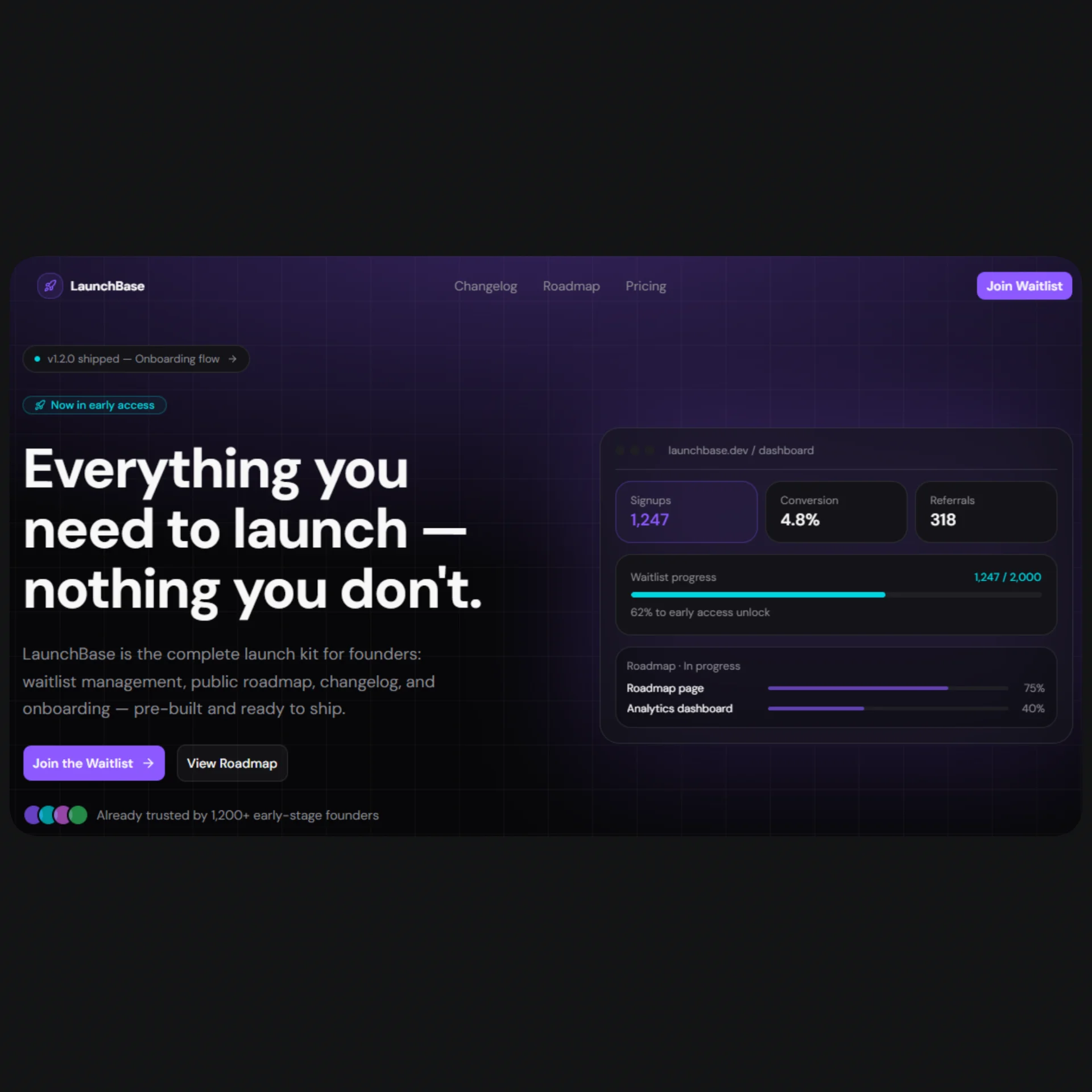
Overview
LaunchBase is the complete product launch kit for founders and indie hackers who want to go from idea to a live, production-ready website in hours — not weeks. Instead of stitching together a landing page builder, a waitlist tool, a roadmap service, and a changelog platform, LaunchBase ships everything pre-built in a single Next.js 15 template: a high-converting landing page, a viral waitlist with referral mechanics, a public roadmap, a versioned changelog, a flexible pricing page, and a guided multi-step onboarding flow. Every page is dark-mode only, built with Tailwind v4, shadcn/ui, TypeScript, and Motion, and wired to a single config.tsx so you can go from clone to customized in minutes without touching component internals.
The template is engineered for real production use, not just as a pretty preview. The component architecture follows Next.js App Router conventions with proper generateMetadata per page, a centralized SEO setup, and no hardcoded styles — every color, gradient, glow, and shadow derives from a fully custom oklch dark-mode palette defined in globals.css. Animations are handled by Motion (formerly Framer Motion) with staggered entrance effects, scroll-driven progress bars, directional page transitions in the onboarding flow, and a looping logo marquee in the social proof section. shadcn/ui components (Accordion, Badge, Button, Input, Switch, Label, Separator) are used throughout so you never reinvent what's already built.
LaunchBase is designed with SEO and conversion in mind from the ground up. The metadata.tsx utility exports a generatePageMetadata function that merges global Open Graph, Twitter card, and robots metadata with per-page overrides — all driven by config.tsx. The waitlist page includes a position counter, a progress bar toward early access, and a referral link generator to drive viral growth. The pricing page ships with a monthly/annual toggle, a highlighted recommended plan, and a trust row. The onboarding flow guides users through four animated steps with persistent state, a project name slug preview, and an integration connection checklist. Everything is responsive, accessible, and ready to deploy to Vercel in one click.
Stack
| Layer | Technology | |---|---| | Framework | Next.js 15 (App Router) | | Styling | Tailwind CSS v4 | | Components | shadcn/ui | | Language | TypeScript | | Animations | Motion (motion/react) | | Icons | lucide-react | | Color space | oklch (dark mode only) | | Deployment | Vercel (recommended) |
Project Structure
launchbase/
├── app/
│   ├── layout.tsx              # Root layout — Navbar + Footer + fonts
│   ├── page.tsx                # Landing page (assembles all sections)
│   ├── waitlist/
│   │   └── page.tsx            # Waitlist page
│   ├── changelog/
│   │   └── page.tsx            # Changelog page
│   ├── roadmap/
│   │   └── page.tsx            # Roadmap page
│   ├── pricing/
│   │   └── page.tsx            # Pricing page
│   └── onboarding/
│       └── page.tsx            # Onboarding flow
│
├── components/
│   ├── layout/
│   │   ├── Navbar.tsx          # Fixed navbar with scroll detection + mobile menu
│   │   └── Footer.tsx          # Footer with link groups + social icons
│   └── sections/               # Landing page sections
│       ├── Hero.tsx
│       ├── SocialProof.tsx
│       ├── Features.tsx
│       ├── HowItWorks.tsx
│       ├── Testimonials.tsx
│       ├── FAQ.tsx
│       └── FinalCTA.tsx
│
├── config.tsx                  # ← Single source of truth for all content
├── metadata.tsx                # Base + per-page metadata helpers
│
├── app/globals.css             # Tailwind v4 theme — oklch palette, gradients, glows
└── public/
    ├── logos/                  # Company logos for SocialProof (swap your own)
    └── avatars/                # Testimonial avatars (swap your own)
Quick Start
1. Clone the repository
git clone https://github.com/your-username/launchbase.git my-app
cd my-app
2. Install dependencies
npm install
# or
pnpm install
3. Install shadcn/ui components
npx shadcn@latest add button badge input label switch separator accordion
4. Run the development server
npm run dev
Open http://localhost:3000.
5. Edit your content
Open config.tsx and replace the placeholder content with your own:
export const siteConfig = {
  name: "YourProduct",
  tagline: "Your tagline here.",
  description: "Your meta description.",
  url: "https://yourproduct.com",
  // ...
};
That's it. Every page, section, and metadata entry updates automatically.
Customization
Content
All copy, links, pricing, features, testimonials, FAQ, roadmap items, and changelog entries live in config.tsx. No need to hunt through component files.
// Change your pricing plans
export const pricingContent = {
  plans: [
    {
      name: "Pro",
      monthlyPrice: 49,
      annualPrice: 39,
      // ...
    },
  ],
};
Colors
The full color palette is defined in globals.css under :root using oklch. To change the primary color:
:root {
  --primary: oklch(0.62 0.25 290); /* violet */
  --accent:  oklch(0.78 0.16 200); /* cyan  */
}
Swap the hue value (third parameter) to shift the entire palette. All gradients, glows, and component colors update automatically since they reference these variables.
Gradients & glows
Reusable visual effects are defined as variables in the @theme inline block:
@theme inline {
  --background-image-gradient-hero: radial-gradient(
    ellipse 80% 60% at 50% -10%,
    color-mix(in oklch, var(--primary) 35%, transparent),
    transparent
  );
  --shadow-glow-primary: 0 0 60px color-mix(in oklch, var(--primary) 45%, transparent);
}
Use them anywhere via Tailwind's arbitrary value syntax:
<div className="[background-image:var(--background-image-gradient-hero)]" />
Logo marquee keyframe
Add this to globals.css for the SocialProof scroll animation:
@keyframes logo-scroll {
  from { transform: translateX(0); }
  to   { transform: translateX(-50%); }
}
Fonts
Fonts are configured in layout.tsx via next/font. Replace font-sans and font-geist-mono with any Google Font or local font — the --font-sans and --font-mono CSS variables in globals.css will pick them up automatically.
Images
- Logos: drop your SVGs into
public/logos/and updatesocialProofContent.logosinconfig.tsx - Avatars: drop JPG/PNG into
public/avatars/and updatetestimonialsContent.itemsinconfig.tsx - Swap the
LogoItemcomponent inSocialProof.tsxwith<Image />fromnext/imageonce assets are ready
Waitlist form
The form in waitlist-page.tsx and FinalCTA.tsx uses a placeholder setTimeout. Replace it with your real endpoint:
// waitlist-page.tsx — handleSubmit
const res = await fetch("/api/waitlist", {
  method: "POST",
  body: JSON.stringify({ email }),
  headers: { "Content-Type": "application/json" },
});
Pre-wired integrations coming in v1.2: Resend, Mailchimp, generic REST.
SEO Setup
LaunchBase ships with a two-layer metadata system.
Global metadata — metadata.tsx
// app/layout.tsx
import { rootMetadata } from "@/metadata";
export const metadata = rootMetadata;
rootMetadata pulls from baseMetadata in config.tsx — title template, OG image, Twitter card, robots, and icons are all set globally.
Per-page metadata
// app/pricing/page.tsx
import { generatePageMetadata } from "@/metadata";
export const metadata = generatePageMetadata("pricing");
Available keys: "home" · "waitlist" · "changelog" · "roadmap" · "pricing" · "onboarding"
Each key maps to a pageMetadata entry in config.tsx. The helper merges the page title and description into the global OG and Twitter fields automatically, and sets the canonical url per page.
OG image
Place your og.png (1200×630) in /public and update siteConfig.ogImage in config.tsx. All pages inherit it unless overridden.
Updating metadata per page
// config.tsx
export const pageMetadata = {
  pricing: {
    title: "Pricing",
    description: "Simple, transparent pricing for every stage of your startup.",
  },
  // ...
};
Final Notes
- Dark mode only. The palette is oklch dark-mode first. There is no light mode toggle by design — the aesthetic is intentional for a startup/SaaS product.
- No hardcoded styles. Every color reference in components uses Tailwind utility classes that resolve to CSS variables from
globals.css. Nostyle={{}}attributes, except for the two cases where a CSS custom property must be passed as abackgroundImagevalue (noted inline in the code). - shadcn/ui components. The template uses
Button,Badge,Input,Label,Switch,Separator, andAccordion. Make sure to add them via the shadcn CLI before running the dev server (see Quick Start step 3). "use client"boundary. All interactive sections and pages are marked"use client". TheFooterand static server components are left as Server Components intentionally.- Placeholder submit logic. Both the waitlist form (
waitlist-page.tsx) and the final CTA form (FinalCTA.tsx) use asetTimeoutas a submission placeholder. Wire up your real API endpoint before going to production. - Referral links. The referral URL in
waitlist-page.tsxis generated client-side from the user's email viabtoa. Replace with a real referral token from your backend before launch. - License. The Starter tier is MIT. The Launch and Studio tiers allow commercial use and white-labeling. Remove the "Built with LaunchBase" badge in
Footer.tsxby clearing the relevant line — no config flag needed.