AI Content Studio — Next.js AI SaaS Template
AI-powered content generation SaaS template built with Next.js 15, Tailwind v4, shadcn/ui, and Motion. Includes editor, AI panel, dashboard, prompt history, and export UI.
Secure checkout via Gumroad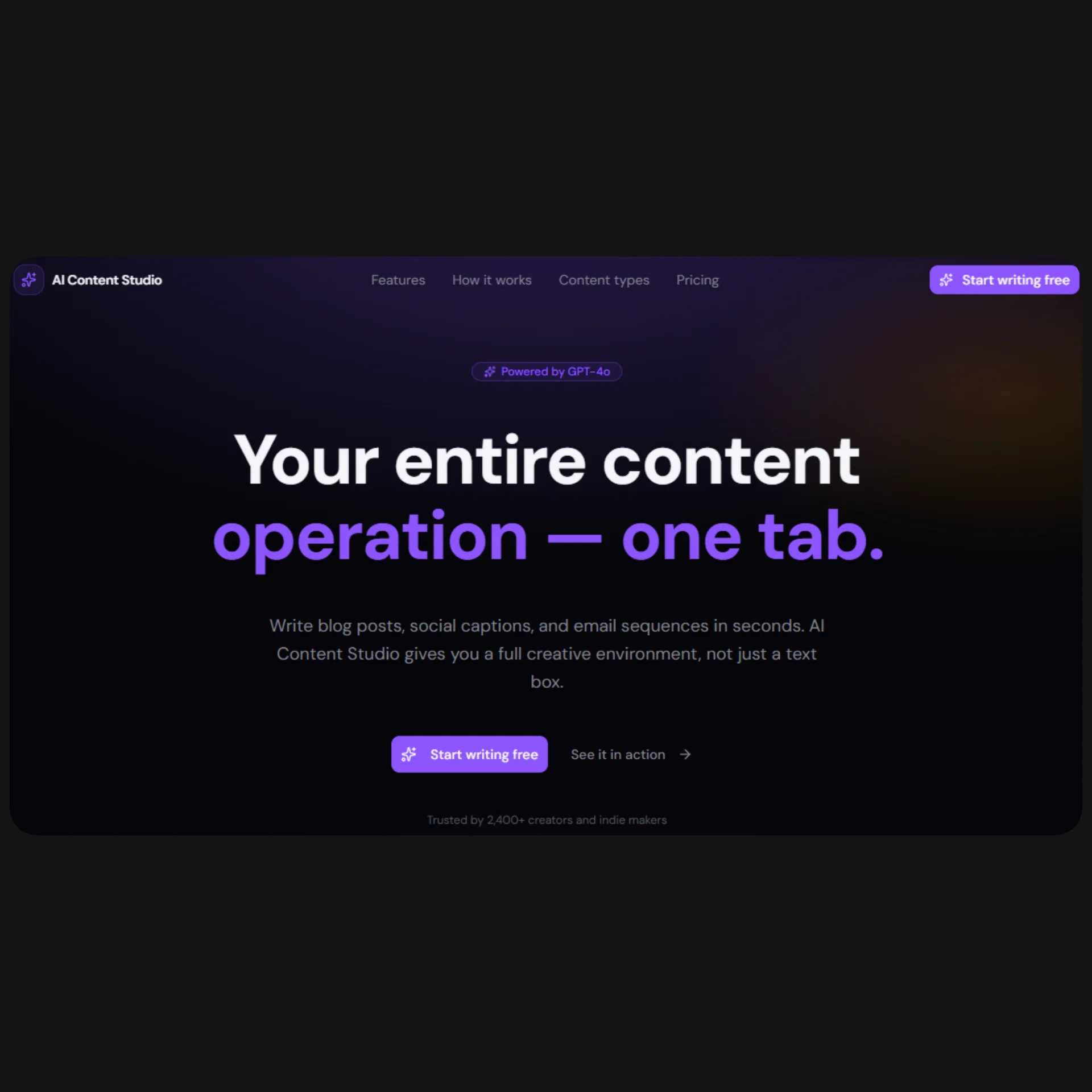
Overview
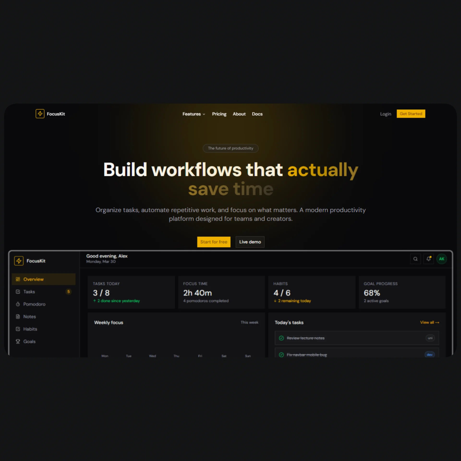
AI Content Studio is a production-ready Next.js SaaS template designed for makers, indie developers, and agencies who want to launch an AI-powered content generation product fast. It ships with a complete marketing landing page — hero, features, how-it-works, content types, pricing, testimonials, and CTA — alongside four fully built internal app pages: a workspace dashboard, a Notion-style block editor with an integrated AI generation panel, a prompt history browser, and an export and share interface. Every section is dark-mode only, built on an oklch color system with electric violet and amber accents that give it a distinctive, premium feel without looking like every other SaaS template on the market.
The template is engineered with a strict separation between content and UI. A single config.tsx file holds every piece of copy, every nav link, every pricing plan, every testimonial, and every quick action — no hunting through component files to update text. Pair that with a metadata.tsx that covers global OpenGraph tags, per-page static metadata, and a buildMetadata() helper for dynamic routes, and the SEO foundation is ready to go before you write a single line of custom code. The design system lives entirely in globals.css, with reusable gradient and glow variables that cascade through every component automatically.
Under the hood, every interactive element uses components from shadcn/ui — Button, Badge, Tabs, DropdownMenu, Switch, Avatar, Progress, Tooltip, Textarea, and more — so there are no custom primitives to maintain. Animations are handled by Motion (formerly Framer Motion) with a consistent fadeUp pattern, useInView scroll triggers, and AnimatePresence for route and panel transitions. The result is a template that looks polished on day one and is easy to extend, rebrand, or hand off to a client.
Stack
| Layer | Technology | |---|---| | Framework | Next.js 15 (App Router) | | Styling | Tailwind CSS v4 | | Components | shadcn/ui | | Animation | Motion (motion/react) | | Icons | lucide-react | | Language | TypeScript | | Color system | oklch, dark mode only |
Project Structure
├── app/
│   ├── layout.tsx               # Global layout — add Navbar + Footer here
│   ├── page.tsx                 # Landing page — compose all sections here
│   ├── dashboard/
│   │   └── page.tsx             # Workspace dashboard
│   ├── editor/
│   │   └── [id]/
│   │       └── page.tsx         # Notion-style editor + AI panel
│   ├── history/
│   │   └── page.tsx             # Prompt history browser
│   └── export/
│       └── page.tsx             # Export & share UI
│
├── components/
│   ├── layout/
│   │   ├── navbar.tsx           # Fixed navbar with mobile drawer
│   │   └── footer.tsx           # Footer with columns and socials
│   └── sections/                # Landing page sections
│       ├── hero.tsx
│       ├── features.tsx
│       ├── how-it-works.tsx
│       ├── content-types.tsx
│       ├── pricing.tsx
│       ├── testimonials.tsx
│       └── cta.tsx
│
├── config.tsx                   # All site content and copy
├── metadata.tsx                 # Global, per-page, and dynamic metadata
└── app/globals.css              # Design tokens, gradients, glows
Quick Start
1. Install dependencies
npm install
# or
pnpm install
2. Install shadcn/ui components
This template uses the following shadcn/ui components. Add them all before running the dev server:
npx shadcn@latest add button badge input textarea separator tabs
npx shadcn@latest add dropdown-menu tooltip avatar progress switch label
3. Install Motion
npm install motion
4. Run the dev server
npm run dev
Open http://localhost:3000.
5. Build the landing page
Open app/page.tsx and compose the sections:
import { Hero }         from "@/components/sections/hero";
import { Features }     from "@/components/sections/features";
import { HowItWorks }   from "@/components/sections/how-it-works";
import { ContentTypes } from "@/components/sections/content-types";
import { Pricing }      from "@/components/sections/pricing";
import { Testimonials } from "@/components/sections/testimonials";
import { CTA }          from "@/components/sections/cta";

export default function HomePage() {
  return (
    <main>
      <Hero />
      <Features />
      <HowItWorks />
      <ContentTypes />
      <Pricing />
      <Testimonials />
      <CTA />
    </main>
  );
}
6. Add the layout
Open app/layout.tsx and add the global metadata, fonts, Navbar, and Footer:
import type { Metadata } from "next";
import { Geist, Geist_Mono } from "next/font/google";
import { Navbar } from "@/components/layout/navbar";
import { Footer } from "@/components/layout/footer";
import { globalMetadata } from "@/metadata";
import "./globals.css";

const fontSans = Geist({ subsets: ["latin"], variable: "--font-sans" });
const fontMono = Geist_Mono({ subsets: ["latin"], variable: "--font-geist-mono" });

export const metadata: Metadata = globalMetadata;

export default function RootLayout({ children }: { children: React.ReactNode }) {
  return (
    <html lang="en" className="dark">
      <body className={`${fontSans.variable} ${fontMono.variable} antialiased`}>
        <Navbar />
        {children}
        <Footer />
      </body>
    </html>
  );
}
Note: The
NavbarandFooterare intentionally excluded from internal app pages (/dashboard,/editor,/history,/export). Use a nested layout insideapp/(app)/layout.tsxif you want a separate shell for the app section.
Customization
Branding and copy
All content lives in config.tsx. Update the following objects to rebrand the template:
// Site identity
export const siteConfig = {
  name: "Your Product Name",
  tagline: "Your tagline here.",
  url: "https://yourproduct.com",
  ogImage: "https://yourproduct.com/og.png",
  twitterHandle: "@yourhandle",
  // ...
};

// Hero section
export const heroContent = {
  eyebrow: "Powered by GPT-4o",
  headline: "Your headline\nhere.",
  // ...
};
Every other section — features, pricing plans, testimonials, footer columns — follows the same pattern. Never hardcode copy directly in component files.
Color palette
The entire color system is defined in app/globals.css under :root. To change the primary color, update the oklch value once and every component updates automatically:
:root {
  --primary: oklch(0.62 0.26 290);   /* Electric violet — change this */
  --accent:  oklch(0.78 0.19 68);    /* Amber — change this */
}
To adjust or add reusable gradients and glows, edit the @theme inline block:
@theme inline {
  --background-image-gradient-hero: radial-gradient(...);
  --shadow-glow-primary: 0 0 40px oklch(...);
}
Pricing plans
Edit pricingContent.plans in config.tsx to add, remove, or modify plans. Each plan accepts:
{
  name: string;
  monthlyPrice: number;       // 0 for free tier
  annualPrice: number;
  description: string;
  highlight: boolean;         // true = featured card with glow
  badge?: string;             // e.g. "Most popular"
  cta: { label: string; href: string };
  features: string[];
}
Navigation
Update navLinks and ctaButton in config.tsx:
export const navLinks = [
  { label: "Features", href: "/#features" },
  { label: "Pricing",  href: "/#pricing"  },
  // add more...
];

export const ctaButton = {
  label: "Get started",
  href:  "/dashboard",
};
SEO Setup
Global metadata
metadata.tsx exports globalMetadata — import it directly in your root layout.tsx:
import { globalMetadata } from "@/metadata";
export const metadata: Metadata = globalMetadata;
It covers: title template, description, keywords, robots, openGraph, twitter, icons, and manifest.
Per-page metadata
Each internal page exports its own static metadata from pageMetadata:
// app/dashboard/page.tsx
import { pageMetadata } from "@/metadata";
export const metadata = pageMetadata.dashboard;
Available keys: home, dashboard, editor, history, export.
Dynamic routes
Use buildMetadata() for pages with dynamic data:
// app/editor/[id]/page.tsx
import { buildMetadata } from "@/metadata";

export async function generateMetadata({ params }: { params: { id: string } }) {
  const doc = await getDocument(params.id);

  return buildMetadata({
    title:       doc.title ?? "Untitled document",
    description: doc.excerpt ?? "Edit and generate content with AI Content Studio.",
    slug:        `editor/${params.id}`,
    noIndex:     true,   // keeps private documents out of search
  });
}
OG image
Replace /public/og.png with a 1200 × 630 image. For dynamic OG images per document, use Next.js opengraph-image.tsx in the relevant route segment.
Final Notes
Dark mode only. The template is intentionally single-mode. The oklch palette is tuned specifically for dark backgrounds — adding a light mode would require a complete re-audit of all color variables.
Mock data. The dashboard, editor, history, and export pages use local mock data. Wire them to your real API or database by replacing the mock arrays (HISTORY, RECENT_PROJECTS, DOC) with fetch calls or server components as needed.
No real AI calls. The AI generation panel in /editor simulates generation with a setTimeout. To connect a real model, replace the handleGenerate function with a call to your backend or directly to the Anthropic / OpenAI API:
const res  = await fetch("/api/generate", { method: "POST", body: JSON.stringify({ prompt, tone, type }) });
const data = await res.json();
setResults(data.variants);
Editor is a textarea. The current editor is a styled <Textarea> with a formatting toolbar. For a true block editor, swap it for Tiptap or Novel — both integrate cleanly with this component structure.
Fonts. The template uses Geist and Geist Mono from next/font/google. Swap the font import in layout.tsx and update --font-sans and --font-geist-mono in globals.css to match your brand.
shadcn/ui registry. All component imports use the @/components/ui/ path alias. If your project has a different alias setup, update tsconfig.json and components.json accordingly before adding components.